The Best Landing Page Design ensures an engaging user experience (UX) and smooth interface (UI) to drive conversions. Focus on fast-loading pages, mobile optimization, and concise messaging tailored to your audience. Highlight key benefits through visuals, customer testimonials, and clear calls-to-action (CTAs). A seamless transition from email links to landing pages can boost lead generation. Incorporate elements like free trials to encourage engagement. By applying these best practices, you can create landing pages that convert visitors into loyal customers and enhance your business success.
What Are the Key Elements of Best Landing Page Design?
- Fast Loading Speed: Ensure quick page performance to prevent user drop-off.
- Mobile Optimization: Design for seamless functionality across all devices.
- Clear Messaging: Use concise, targeted content that resonates with your audience.
- Engaging Visuals: Incorporate product benefits and customer testimonials to build trust.
- Compelling CTA (Call-to-Action): Guide users to take desired actions effortlessly.
- Seamless Navigation: Ensure smooth transitions from email or ad links to the landing page.
- Offer Incentives: Include free trials or discounts to encourage conversions.
By following these elements, the Best Landing Page Design can effectively convert visitors into leads and drive business growth.
What Are the Best Practices for Landing Page UX?
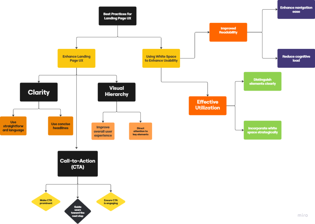
Here’s a flowchart that explains landing page UX best practices.
How to Create High-Converting CTAs on Your Landing Pages?
- Use clear and compelling language:
- Incorporate action-oriented verbs that create urgency (e.g., “Get Started Now,” “Claim Your Free Trial”).
- Make CTA buttons stand out visually:
- Use contrasting colors and ensure strategic placement on your landing page.
- Position CTAs above the fold for maximum visibility.
- Test and optimize CTA performance:
- Experiment with different variations to determine what resonates best.
- Adjust based on performance metrics to continually improve results.
Designing Eye-Catching CTA Buttons
- Use contrasting colors:
- Ensure the button stands out against the background for easy visibility.
- Keep text clear and action-oriented:
- Prompt users with direct, motivating language to encourage clicks.
- Experiment with design elements:
- Play with button size and use whitespace to draw attention effectively.
Positioning CTAs for Maximum Impact
- Place CTAs where users naturally pause:
- End of content sections or after engaging visuals.
- Use contrasting colors and compelling language:
- Make your CTAs noticeable and persuasive to encourage action.
- Align CTAs with the user’s journey:
- Tailor prompts to suit the user’s context and needs.
- Test different placements:
- Use A/B testing to identify the most effective positions for higher conversions.
Testing and Optimizing Your CTAs
| Aspect | Description |
|---|---|
| Analyze User Interactions | Identify which phrases, designs, and elements resonate best with your audience. |
| Optimize Based on Data | Make iterative improvements to boost conversion rates. |
| Experiment with Key Elements | Test colors, placements, and wording to find the perfect combination. |
What Are the Latest Trends in Landing Page Design for 2024?
- Emphasizes clean layouts and ample white space.
- Bold typography and vibrant colors enhance visual appeal.
- Animations and micro-interactions boost engagement.
- Mobile optimization is crucial for user experience.
- AI-driven personalization increases conversion rates.
1: Adopting New Design Systems
- Establishes cohesive guidelines for better collaboration.
- Fosters consistency across products, enhancing user experience.
- Streamlines the process for quicker iterations and agile feedback response.
2: Incorporating Graphic Design Trends
- Minimalism enhances clarity; bold colors create impact.
- Motion graphics engage audiences and improve interactivity.
- Staying updated ensures relevance with contemporary audiences.
3: Utilizing User Testing Feedback
- Identifies pain points through real user insights.
- Refines products based on actual experiences.
- Adopts a user-centered approach to increase satisfaction and engagement.
How to Use Testimonials and Social Proof on Landing Pages?

Incorporate authentic feedback and user reviews on landing pages to enhance credibility and build trust. Social proof elements like ratings and case studies highlight product effectiveness, creating urgency and encouraging action.
Highlighting Customer Success Stories
Share real-life examples of customer achievements to inspire prospects and showcase your product’s benefits, fostering trust and credibility.
Designing an Effective Testimonial Section
Use authentic testimonials with photos or videos for a personal touch. Keep the layout clean, update content regularly, and strategically place the section to capture attention.
Leveraging User Reviews
Positive reviews boost reputation, address concerns, and build customer loyalty.
In Conclusion
The Best Landing Page Design combines fast performance, mobile optimization, and engaging content to convert visitors into customers. By using clear messaging, compelling CTAs, and social proof, businesses can build trust and drive actions. Incorporating user feedback and staying aligned with modern trends ensures relevance and effectiveness. A well-designed landing page not only boosts lead generation but also fosters long-term customer loyalty, helping businesses grow.